The Strange Case of Mr William T. Horton
Championed in his day by friend and fellow mystic W. B. Yeats, today the artist William T. Horton and his stark minimalistic creations are largely forgotten. Jon Crabb on a unique and unusual talent.
March 9, 2016

The publisher Leonard Smithers (1861–1907) launched, bankrolled or otherwise helped the careers of an impressive variety of names: Richard Burton, Aubrey Beardsley, Aleister Crowley, Ernest Dowson, Oscar Wilde, W. B. Yeats, and Max Beerbohm were all referred to as “Smithers People” at one time or another. He drew to his circle the most eccentric and interesting characters of the era and in 1896 launched the arts and literary magazine the Savoy to showcase many of them. Aubrey Beardsley was made art editor while Arthur Symons was placed at the editorial helm. While not entirely a “Decadent” outfit (it also published George Bernard Shaw and Joseph Conrad), the magazine became a lightning rod for the curious and in it, as Bernard Muddiman wrote, “the abnormal, the bizarre, found their true home”1. It also launched the career of an illustrator and mystic named William T. Horton. Arguably one of the most fascinating and most unusual of all the “Smithers People”, he published very little work and remains almost completely unknown today.
In total, Horton contributed to four issues of the Savoy, which actually makes him the magazine’s most regular artist besides its art editor Aubrey Beardsley. His first contribution was three drawings accompanied by biblical quotes, which appeared in the second issue. These incredibly striking images bear little resemblance to other work of the period. Even in an era of bizarre decadence, they not only look unique, but practically leap off the page and declare their own weirdness. The Three Visions themselves are evoked by expansive swathes of black and white, minimal line, and a style that is simple yet highly unusual and even a little unnerving. These early pictures foreshadow the interests that would define William T Horton’s art: effective marshalling of black and white, strangely sinister figures, and an intense mysticism.


The three images which make up Three Visions, published in The Savoy No. 2 (April, 1896) — Source.
Horton is a mysterious character in part because his catalogue of published work is so small, and in part because there is so little written about him. Ten years after his death, Roger Ingpen published William Thomas Horton (1864–1919): A Selection of His work with a Biographical Sketch (London: Ingpen and Grant, 1929), which provides a brief sketch of his life, but little more. His letters to W. B. Yeats have been catalogued and archived, but there is precious little beyond that. It is from these letters that we know Horton was initiated into the famous Golden Dawn occult society on Saturday, March 21, 1896, with W. B. Yeats as his sponsor.2 He also entered into a chaste, platonic relationship with fellow mystical enthusiast Amy Audrey Locke. Both are mentioned obliquely in W. B. Yeats’ dedication for his esoteric work, A Vision (1925). Horton was a lonely figure, but his friendship with Yeats was an important one which led directly to his initial Savoy work. Yeats shared a flat with Arthur Symons at Fountain Court3 and in a letter dated March 28, 1896, Horton writes, “I must write & thank you most warmly for laying my drawings before Symons who has very kindly chosen 3 for the forthcoming Savoy.”4
Horton is also known to have met his most obvious point of comparison, Aubrey Beardsley. Roger Ingpen reveals the amazing synchronicity that Aubrey Beardsley actually went to the same Brighton Grammar School that, some years earlier, Horton had gone to. Prior to his work for the Savoy, “He paid a visit to Beardsley whom he described as entirely unspoiled by his great success, and who gave him some words of encouragement at a time when he had hitherto obtained little encouragement elsewhere”.5 He is also quoted as having spoken at times “of the beauty of Beardsley’s line almost in despair”.6 It is worth noting that Beardsley (1872–1898) reached his creative peak and died by the age of twenty-five, while Horton (1864–1919) did not start studying art until he was twenty-nine and begin professionally illustrating until he was thirty-two.7 Comparisons between him and Beardsley are usually made in the few contemporary reviews he received, and have continued since his death. Peppin and Mickelthwaite in Dictionary of English Book Illustrators: The Twentieth Century (London: John Murray, 1983) wrote “Horton’s drawing had qualities of directness and clarity, even if it lacked Beardsley’s sophistication and complexity; his imagery was often powerful and original — he believed it to be inspired by some occult influence.”8
But while there are elements of the bizarre in the work of both illustrators, Horton is far less similar or derivative than a great many other Beardsley imitators that populated the late 1890s. There is a loneliness and directness unique to his art. Where Beardsley celebrates the excesses of civilization, detailing it in complex and exquisitely overwrought detail, Horton conjures isolation with wide open spaces of blank page punctuated with sparse moments of intricacy. Beardsley’s final drawings for the Savoy exemplify his growing complexity but by comparison, Horton’s other Savoy illustrations are stark affairs, such as his Ballade des Pendus in No. 6 and his drawing in No. 7 to accompany Keats’ lines:
Now more than ever seems it rich to die
To cease upon the midnight without pain.

Horton’s illustration in the Savoy No. 7 — Source.
In 1898, the arts and literary magazine Dome included a few Horton images, which are of a slightly less sinister variety than his other work. That same year though, the editor of the Dome — E. J. Oldmeadow — published Horton’s masterpiece, A Book of Images, through his company Unicorn Press. This showed him moving further into symbolist, mystical art and features a number of profoundly empty, almost existentially threatening images that dealt with modern city themes. The Wave shows a town dwarfed by an immense tsunami, poised to crush the tiny houses. Nocturne illustrates a city’s skyline — a diminutive device he used several times — and then cleaves it in two with a river. The Gap continues the theme of separation with an abyssal chasm between two barely discernible settlements.

The Wave, from Horton’s A Book of Images (1898) — Source.

Nocturne, from Horton’s A Book of Images (1898) — Source.

The Gap, from Horton’s A Book of Images (1898) — Source.
If his grotesque qualities were harking back to the Decadence of Beardsley, then surely his interest in separation, loneliness, and fractured humanity was heralding the arrival of the Moderns. W. B. Yeats wrote the introduction to A Book of Images and firmly established the mystical qualities behind the work, writing that Horton “has his waking dreams, but more detailed and vivid than mine; and copied them as if they were models posed for him by some unearthly master”.9 He later calls Horton’s images “the reverie of a lonely and profound temperament”.10 Yeats’ introduction also reveals the reason behind Horton’s preference for black and white images:
He tried at first to copy his models in colour, and with little mastery over colour when even great mastery would not have helped him, and very literally: but soon found that you could only represent a world where nothing is still for a moment, and where colours have odours and odours musical notes, by formal and conventional images, midway between the scenery and persons of common life, and the geometrical emblems on mediaeval talismans.11
This profession to the synaesthesia of mystical vision aligns him with the occult theory of correspondence in vogue with Baudelaire, Rimbaud, and the Symbolists. The impossibility of realizing the true symphony of correspondence outside of mystical reverie confines him to black and white, but arguably his restraint allows for an even bigger impact on the imagination. In a letter to Yeats dated July 30, 1896, Horton writes:
I agree with Dürer that it is impossible to depict exactly the unearthly beauties & colours that form part of my Visions. Blake attempted to depict the colour & to my mind failed [. . .] Even the form in black & white gives only an idea but then the colour can be filled in by imagination. But in form and colour the imagination from the outset is defiled, adulterated [. . .] Never yet have I seen a coloured picture that could live up to the colouring of some of my Visions. Often the loveliness of colouring in Visions is brought about by the flashing, quivering, intermingling play of myriads of different tints, tints often never seen in Nature. And then there is the entrancing music in which Visions of beauty as it were, bathe and revel. To give the nearest idea of Visions would require the Greatest Artist & the Greatest Magician working in one.12

The Path to the Moon from Horton’s A Book of Images (1898) — Source.
After the Savoy ceased publication at the end of 1896, the relationship between Leonard Smithers and Horton continued and resulted in Horton illustrating a high-quality edition of Edgar Allan Poe’s Raven [and] The Pendulum in 1899. Given the disturbing, psychological tension of Poe, this would appear a perfect match, but for some reason — possibly at Smithers’ encouragement — Horton opted to do black chalk drawings, which are not as successful as his usual pen line drawings. He seemed to acknowledge this in a letter to Yeats: “Some, like Smithers, Robert Ross etc. speak highly of my chalks, others, like Oldmeadow, prefer my b. & white landscapes. You must remember the Poe chalks are merely an introduction to this style — I have done several since then which shew improvement.”13

“While I pondered . . . Over many a quaint and curious volume”, an illustration by Horton for Edgar Allan Poe’s Raven [and] The Pendulum (1899) — Source.

“I saw that some ten or twelve vibrations would bring the steel in actual contact with my robe”, an illustration by Horton for Edgar Allan Poe’s Raven [and] The Pendulum (1899) — Source.
In the late 1890s there is evidence that Leonard Smithers might have seen Horton as a possible replacement for Aubrey Beardsley, who had been a perfect illustrator for Smithers’ publications, but unfortunately for both of them was now dying rapidly from tuberculosis. In a letter to Yeats, Horton seemed optimistic about his relationship with Smithers: “I have another set for Vol. 2 of Poe if Vol. 1 pays & perhaps another Book of Images with drawings in Black Chalk — a bigger thing than the Unicorn B. of Images”.14 If he had made an impression on Smithers, it is uncertain what others thought of him. Ernest Dowson wrote to Smithers to say that the Savoy No. 2 was “better than the first number, as far as its literature, but Beardsley is not so good, & your new man Horton, I do not care for”.15 In a morbid twist, it seems as though Horton was inspired by Dowson when he illustrated the ghoulish front cover to a translation of Knut Hamsun’s Hunger, published by Smithers in 1899. Oscar Wilde took the starving man on the cover to be a “horrible caricature of Ernest [Dowson]”.16 With overtones of Dorian Gray, Wilde wrote Smithers after publication, “The picture of Hunger grows more like Ernest daily. I now hide it.”17 Dowson, the Decadent poet, was renowned for his youthful beauty but within a year would die from chronic alcoholism, aged just thirty-two.

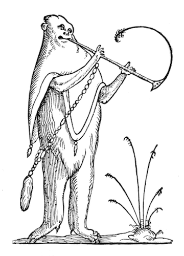
Horton did no further work for Smithers after Hunger and Poe, and retreated from that world of “naughty nineties” decadence further into solitary mysticism. In the early years of the new century he had several illustrations published in the Occult Review and several published in the Green Sheaf (1903–4), a magazine edited and published by Pamela Coleman Smith. Smith was the artist who illustrated the iconic Rider-Waite tarot deck (more properly, the Rider-Waite-Smith tarot deck) in 1910. Besides his own Book of Images, Horton also did illustrations for two other mystical books; another visionary text of his own, The Way of the Soul, a Legend in Line and Verse (London: William Rider & Son, 1910); and H. Rider Haggard’s The Mahatma and the Hare, a Dream Story (London: Longmans, Green & Co., 1911).

One of two Horton images featured in H. Rider Haggard’s The Mahatma and the Hare, a Dream Story (1911) — Source.
Horton was clearly immersed in the London occult scene during the 1900s, but in 1905 he also finally attracted the attention of the Studio, the era’s foremost journal of design and illustration. The September issue featured several Horton illustrations, which are of a more mature and less ominous style. The short review, printed in full below, is a good insight into the critical reception of his work at the time.
In their particular style they are decidedly of the best order, Mr Horton’s line being clear, precise and definite, and expressively decorative. It is a style of drawing which Mr Horton has always practiced successfully in his illustrations. It may be said to owe its inception partly to the genius of Aubrey Beardsley, and partly to Mr Anning Bell. Mr SH Sime has used it often admirably, and sometimes carelessly, in his designs. Mr Horton is always careful, but the patience with which he elaborates in places is always cleverly relieved by empty white spaces. In the management of these white spaces the artist shows cunning, and in the economical use of his line. It is a pretty and effective method of making a decorative drawing; and Mr Horton’s work is an example of sound and pure line work in a class of designing which depends entirely upon the purity and vigour of the drawing of single lines for its success as a method of artistic expression.18
In the final assessment it is this superior draughtsmanship that distinguishes him as much as his “strange adventure” in the occult described by W. B. Yeats.19 His highly symmetrical curvilinear forms are quite unique among his generation and show a skilful hand. Sadly, he published little after 1912 and, in 1916, suffered a mental breakdown after the death of his partner Amy Audrey Locke. In 1918, he was hit by a car and further incapacitated. He died in obscurity the following year. His friend Roger Ingpen published a biography in 1929 and began with the words: “He was not widely known to the general public, but his gifts were highly appreciated by a small circle who are faithful to the conviction that his work is destined to a wider recognition in the future.”20
I strongly hope that this comes to pass and that you too will be struck by his extraordinary drawings.
- Publisher to the Decadents: Leonard Smithers in the Careers of Beardsley, Wilde, Dowson
A look at the life and influence of one of the most important figure in the literary world of late Victorian England. Primarily known his day for publishing books of upscale pornography, he also published a wide array of the most important writers and artists of Decandence, including Oscar Wilde, Audrey Beardsley, and W. T. Horton.

The Public Domain Review receives a small percentage commission from sales made via the links to Bookshop.org (10%) and Amazon (4.5%). Thanks for supporting the project! For more recommended books, see all our “Further Reading” books, and browse our dedicated Bookshop.org stores for US and UK readers.
Jon Crabb is a writer and editor with interests in the fin-de-siècle, forgotten culture, the esoteric and anything generally weird and wonderful. He lives in London and works as Editor for British Library Publishing. He also runs their twitter feed, which he would like you to check out now.
Enjoyed this piece? We need your help to keep publishing.
The PDR is a non-profit project kept alive by reader donations – no ads, no paywalls, just the generosity of our community. It’s a really exciting model, but we need your help to keep it thriving. Visit our support page to become a Friend and receive our themed postcard packs. Or give a one-off donation. Already a supporter? A huge thank you for making all this possible.

Imagery from this post is featured in
Affinities
our special book of images created to celebrate 10 years of The Public Domain Review.
500+ images – 368 pages
Large format – Hardcover with inset image