Fraktur Folk Art (ca. 1750–1820)

The southeastern corner of what is now Pennsylvania was once home to entire towns of religious dissidents. All had been persecuted in Europe, and sought freedom in the colonies. There were clusters of Mennonites, Moravians, Lutherans, and various other German-Protestant sects, some obscure and eccentric. Residents of the Ephrata Cloister, for instance, practiced extreme calorie restriction, sleep deprivation, and celibacy. Another group followed the sixteenth-century teachings of Caspar Schwenckfeld von Ossig, a bearded, deaf ornithologist who split ways with Martin Luther over the meaning of the sacrament. These motley religious communities had significant theological differences, but shared a great deal as well — they were farmers who spoke German, prized religious tolerance, and practiced the same distinctive artform: fraktur.
Fraktur is named after the font — heavy, angular, old-timey — which is usually called “blackletter” in the United States. Fraktur was ubiquitous in eighteenth-century Germany, and it remained so long after other European countries switched to the more readable Roman. (Fraktur is now associated with the Nazis, who used it extensively in propaganda, going so far as to outfit government offices with Fraktur typewriters.) How did the name of a font become the name of an art form? Fraktur art existed at the edges of text, as a decorative accessory of writing. It embellished fraktur script. In Pennsylvania and beyond, baptismal records, land deeds, certificates of accomplishment, bookplates, birth registries, and sometimes valentines were lettered in German-language fraktur, and decorated with the hearts, vines, and tulips that came to be characteristic of fraktur art.
Fraktur has its origins in folk art traditions from Alsace, Switzerland, and the Rhineland, but in America it became more colorful, elaborate, and freehand, and far more apt to dominate the script it sought to embellish. The genre’s golden age was the period between 1790 and 1830 — a time when the American religious context was still strong, but the European influence less stultifying. The forms are highly stylized. Hearts, flowers, angels, and various birds are repeated over and over, to soothing effect. The palette favors bold primary colors, traditionally made of inks concocted from berries, iron oxide, and apple juice. The composition is orderly. The tidy leaves of the tidy vines are perfectly equidistant, and the flowers pared down to floral symbols. The goldfinch that appears in many fraktur images is drawn in such a specific way it’s still known by its German name: distelfink. Symmetry reigns, and when it doesn’t, the composition is otherwise balanced. One of the most common fraktur motifs is the “three-heart design” wherein a large heart is complemented by two smaller hearts on either side of its apex — in fraktur, even the most curvaceous of shapes assumes the rootedness of a square.
Fraktur scholars and aficionados can distinguish Ephrata Cloister fraktur from Schwenkfeld fraktur from Mennonite fraktur. They can also identify the work of certain artists by sight —whether by name, or, for those who left their work unsigned, by epithet: the Nine Hearts artist or the Stoney Creek artist. But to simply appreciate the form, no expertise is necessary. Fraktur is straightforward and earnest. There is no irony and no secret code. Its pleasures are the homey kind. To contemporary eyes, the imagery signals feminine domesticity, but it wasn’t always so. Nearly all fraktur artists were men, and the papers they embellished were civic and religious documents. It is true, however, that fraktur was designed for private, domestic pleasures. It was not an artform of display or exhibition, but of personal devotion. Some of the most beautiful examples of fraktur are bookplates, hidden most of the time.
Collectors and art historians have tried various ways of elevating Fraktur’s aesthetic status. One line of argument contends that the hearts and birds are all symbolic, such that each composition contains a decodable message. Others have tried to prove a direct lineage from medieval illumination. The evidence for either of these claims is so thin that the motivation behind them becomes suspect. Not all art need grasp toward grand significance to be enjoyed. A private pleasure, a small delight, a flourish both unnecessary and perfectly lovely is reason enough to look, and look again.
Enjoyed this piece? We need your help to keep publishing.
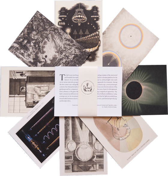
The PDR is a non-profit project kept alive by reader donations – no ads, no paywalls, just the generosity of our community. It’s a really exciting model, but we need your help to keep it thriving. Visit our support page to become a Friend and receive our themed postcard packs. Or give a one-off donation. Already a supporter? A huge thank you for making all this possible.


 | Underlying Work Rights | PD Worldwide |
| Digital Copy Rights |
| |
 | Download | Right click on image, or see source for higher-res |
Birth certificate of Georg Mayer, ca. 1805
Birth certificate, ca. 1840
Birth certificate, ca. 1765
Birth certificate of Adam Koff, ca. 1762
Certificate of accomplishment, ca. 1766
Birth certificate of Jacob Schefer, ca. 1761
Birth certificate of Henrich Muskenug, ca. 1769
Birth certificate of Christian Koff, ca. 1780
Family record of James Travis and Susan Hyatt, ca. 1811
Baptismal certificate of Catarina Titzlir, ca. 1765
Baptismal certificate, ca. 1785
Birth and baptismal certificate of Johanes Bender, ca. 1784
Birth and baptismal certificate of Maria Frey, ca. 1813
Birth and baptismal certificate, ca. 1792
Birth certificate and family record of William Potter, ca. 1750
Birth certificate of Johann Georg Stumpf, ca. 1770
Birth certificate of Johann Georg, ca. 1785
Birth certificate of Johann Miller, ca. 1787
Birth certificate, ca. 1755
Birth certificate, ca. 1773
Birth certificate, ca. 1777
Birth certificate, ca. 1784
Birth certificate, ca. 1788
Family record for John and Anne Hoogh
Family record of Abraham Requa and Bethyah Hopkins, ca. 1782
Family record of D. Johnson, ca. 1766
Family record of David Rogers and Rhoda Osborn, ca. 1787
Family record of Edward Head, ca. 1755
Family record of Isaac Dickisson, ca. 1816
Family record of J. Norris, ca. 1791
Family record of Jacob Esser, ca. 1792
Family record of James Runnals and Tamson Ham, ca. 1778
Family record of Levi Coles, ca. 1761
Family record of Peter Ford and Eliza King, ca. 1839
Family record of Peter Hunt, ca. 1779
Family record of William Degroot, ca. 1780
Family record, ca. 1787
Family register of Mr and Mrs Upton, ca. 1777
Family register of Nathaniel and Mary Bangs, 1786
Marriage and family record of Ebenezer Spencer and Mehetabel Buswel, ca. 1791
Marriage certificate of Colin and Elizabeth Lachlan, ca. 1810
Portion of birth certificate, ca. 1808
Mar 30, 2023